Medium app (iOS): Personalization & organization
Problem:
The app does little to organize articles and publications by content. Avid Medium users need a more efficient way to access the content they find meaningful so that they aren’t frustrated while trying to fuel their personal and professional growth. Some users complain of too much “clickbait” and too much scrolling to find their desired content.
Challenge:
Two weeks to design and test a new concept to the Medium mobile application, and then present our ideas to stakeholders.
Solution:
The new features we added allowed mobile app users to:
See more of their preferred content on the landing page
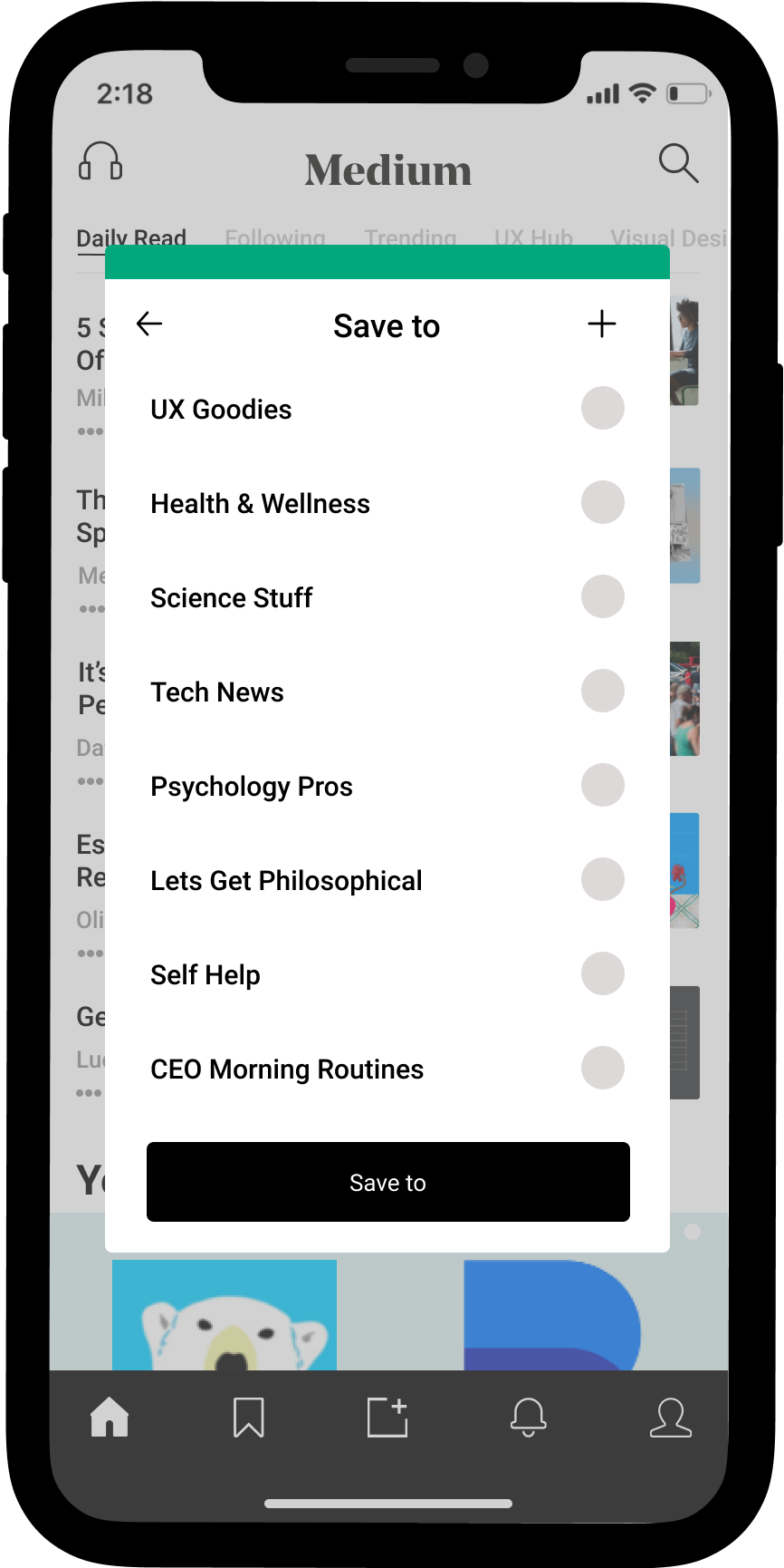
Save specific content to named “folders”
View preferred content by category
My Contributions:
User interviews, research analysis, persona creation, product and business strategy alignment, wireframes, mock-ups
Tools: Figma (wireframing, prototyping, mock-ups), Miro.
Team of 4
What is medium?
Medium is an inclusive publishing platform that allows users from anywhere and everywhere to showcase their best writing skills. It is positively received by its users, many of whom are focused on fueling professional and personal development. Medium users praise the high-quality content that can be found in their corner of the web.
research
As a team, we analyzed different aspects of the application to see how the app stood up in terms of features against applications in a similar space.
Findings:
Lots of scrolling necessary to be able to find user’s preferred content.
No trending content specific to any particular content
Content is not organized in any manner
Digging deeper: user interviews
A glimpse into insight trends
The biggest takeaways from these interviews were related to the ability to access desired and targeted content. Medium users are generally satisfied with their experiences and praise the high-quality content they are able to find through this outlet.
The team struggled with finding direction at this point, as one of our interviewees expressed frustrations with the paywall, and through app reviews, we discovered this is a big complaint of many users. The challenge that we faced was that there was no significant data regarding the paywall from the majority that we interviewed. The rest of the team was very focused on the paywall issue, while I was looked at our insights at-hand.
I was able to help guide the team back to our data and get us “unstuck.” I pointed out the major trends that were already identified and began a discussion on how they were all related. It was after this discussion that we had a clear direction.
in a nutshell
Navigating to desired content was more difficult in Medium than it was in other applications.
The team collaboratively created our persona, Fabio. The creation of Fabio helped guide the design decisions that came next, along with the most important features to focus on during the two-week timeline.
main goals were to focus on helping fabio
Feel less overwhelmed
by searching for content,
increase control
over the content initially seen,
& bring desired content to the forefront
To further hone in on our focus, we prioritized our features within a matrix. We brainstormed features that would help with finding desired content on the landing page, as this is the initial exposure to Medium’s content and most accessed page. We focused on LOW effort/HIGH impact features due to our short turnaround time.
user flows
To better understand what screens needed to take priority, user flows came into play. We focused on a minimum viable product (MVP), and asked ourselves what, at minimum, is needed to have a functioning/usable product? We decided that the homepage and navigating from preferred reading was important. You can see there were 2 iterations of these as we realized that there were more steps than originally thought.
Reading list flow v.2
Homepage flow v.2
design studio
We held a design studio and each took the floor for a few minutes to share our ideas with the team. We dot-voted for the ideas we thought best suited our goals to help our persona, Fabio. We took inspiration from the likes of Pinterest, Instagram, Apple News, and Apple Weather.


digital wireframes
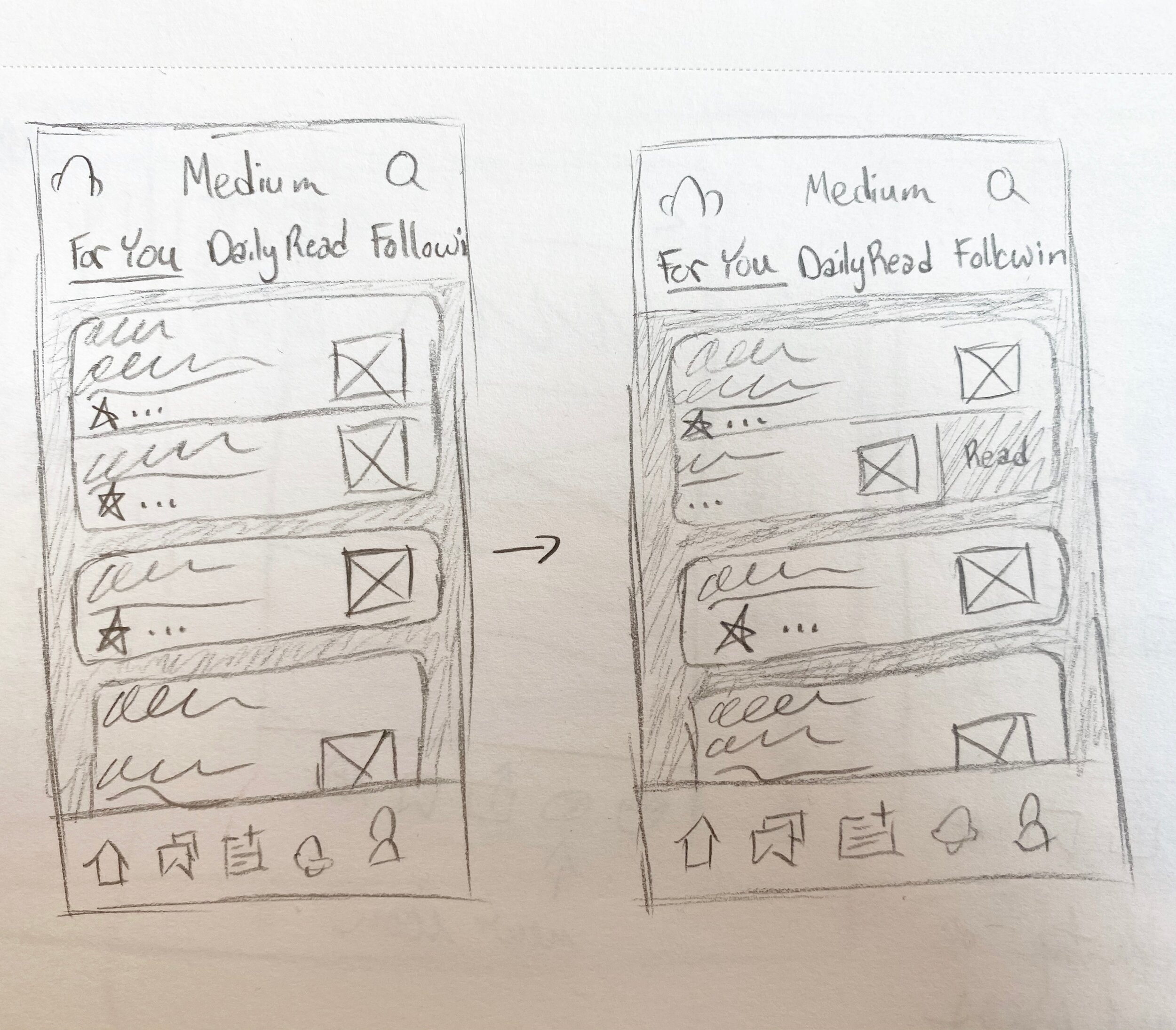
Next came wireframing and raising the fidelity. Below are the key screens that increase functionality in terms of finding and saving desired content. Want to see the prototype we used for usability testing? See the prototype here .
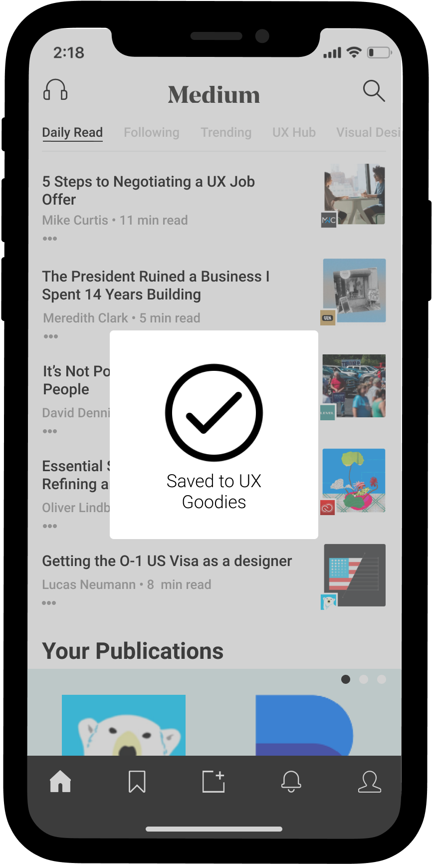
Left to right: new landing page with user’s specific publications featured and horizontal navigation, following page allows users to access followed writers, UX hub page is an example of a user’s specific favorite content as a global navigation option, an example Spotify article page with more visuals integrated into the copy, and Save To overlay features a variety of user’s topic-specific folders to be able to save articles.
usability testing plan & Results
The metrics we set for usability testing:
Quantitative: Once a user has processed their preferred content, they should be able to save, categorize, and access it via the reading list within 2 minutes and 8 clicks.
Qualitative: Features will allow the user to complete the task without frustration.
Testers passed our first round with flying colors. We did not have any insights that would lead us to iterate. That can’t be right, can it? After consulting with design managers, we felt it was best to run another round of tests. We realized that we didn’t all consistently look for the insights necessary and were too focused on the quantitative results.
Learnings
I am better at “zooming out” than I thought. I tend to think I am someone who gets bogged down by details, but I learned I have the ability to help steer the team away from that if need be. I am good at recognizing when something doesn’t quite align with our goals.
Do not speed through usability testing. It is rare that you come out of testing without any actionable feedback. If you do, question it.
I love the collaborative team environment. As long as everyone is on the same page about expectations, responsibilities (in work and in life), and willingness to give and receive feedback, it can work really well. Taking the time to establish a team plan can be really valuable.
next steps
1. Revisit the priority matrix to work on the higher effort/ high impact features, such as further organization of the saved articles.
2. Explore the paywall and zero in on improving the app for non-paying subscribers. Amongst the app reviews and from one of the user interviewees, we saw a trend in dissatisfaction with the paywall. It would be fun to explore other ways to support writers such as micro-tipping or writer subscriptions.


